
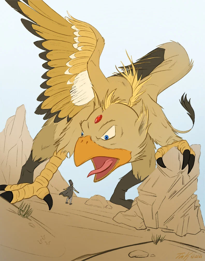
GRIFFIN
Here is a small tutorial on the creation of the Griffin illustration!

Thumbnailing
At the beginning of the project, I will start sketching out the initial idea. Thumbnailing a few different ideas to choose from.

ROUGHS
Shortly after thumbnailing, I will start to think more about the composition, making sure the image silhouettes read clearly and are broken down into the rule of thirds.

TIEDOWNS
Once I get the Roughs into a place I’m happy with, I’ll start cleaning it up. To start I will lower the opacity of the rough sketch and create a new layer above it. I start to tiedown the shapes and form of the illustration to clarify it more.

CLEAN UP
Once again, I’ll start with a new layer above the tiedowns and start to put the final line down. Adding thick and thin lines to add more depth into the outlines.
FLATS
I’ll drop down some initial colors below the Clean Up layer, or better known as Flats! These colors might not even be the final colors, but they help create a way to select giant areas at a time to paint and change through out the coloring phase. In this case, I could easily select the color of the beak with a selection tool and start coloring on it, with out having to worry about coloring on the fur.

HIGHLIGHTS &SHADOW
Once I’m happy with the colors, I’ll create two more layers. Once for shadows, and another one for highlights. Sometimes the layers might be set to a specific blending mode like Multiply or Overlay. Depending on the illustration I might just go with black shadows that opacity are set to 50% on multiple, while other times I might actually select the darker color I want to represent the shadows. Same with the highlights.
EFX
The final stage of the illustration is adding some effects to help make it pop! This might be gradients to help further darken areas or even add blur to a layer for atmospheric perspective. For this illustration, I blurred the foreground to take it out of focus.
Thanks for taking the time to read this behind the scenes tutorial on my process. I hope you enjoyed it.
-Tim